Creating an Engaging Landing Page Design
According to data, people prefer to engage with websites that are beautifully designed. 38% of people will stop engaging with a website if the content and layout is not attractive. As a general rule, keep your layout simple, clean, and designed in a way that draws attention to the most important parts. Some more detailed tips:
- Where the InGo widget sits on the page can have a large impact on how many advocates you generate.
- Giving social its own page in registration:
- gives you more room to highlight the benefits of using social registration (see your friends and colleagues, post and invite your friends and colleagues).
- It helps you add an incentive e.g. “Register with social media and get entered to win a $100 Visa Gift Card!” or “Register with social media, post, and we’ll plant x trees in your name”
- It also allows you to build a call to action (“Register”, “Join me”) right into the page
- It is important to include a short description of your event, webinar, content, whitepaper, case study, or award programme so that people know what they are about to sign up to/ participate in.
- Login Widget design also impacts conversion rates - learn about widget design optimization here
If you decide to build your landing page through InGo, creative specs are the following: 600 x 200 px; < 1MB; jpg/png/gif/animated gif
Examples of Engaging Page Headers:
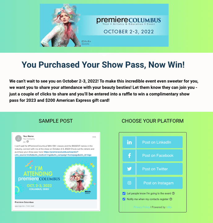
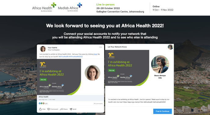
Examples of engaging landing pages:


